QM 8 - Course Examples
Accessibility and Usability
Example 1 - Intro to Physical Geography
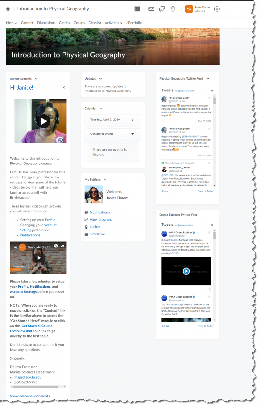
Usability: This is an example of the course home page from a sample Introduction to Physical Geography online course. When students enter the course they land on the course home page. An announcement on the course home page welcomes the students and tells them how to get started.
Accessibility: The first announcement students see when they enter this sample Introduction to Physical Geography course is the welcome message which includes a welcome video. While the video does not have closed captions, a transcript of what is said in the video is listed in the announcement for accessibility purposes.
Example 2 - Intro to Physical Geography
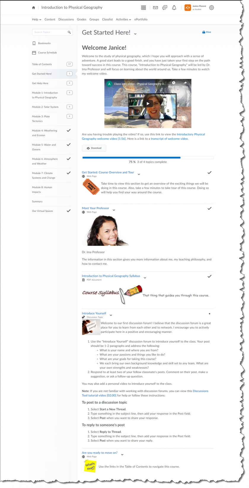
Usability: This is an example of a Get Started Here module from a sample Introduction to Physical Geography online course. The module begins with a welcome video. The course overview and tour explains how to get around in the course. The module ends with instructions on what to do next. Additionally, the Table of Contents is organized by modules making it easy for students to navigate through the course.
Accessibility: The welcome video in this sample Introduction to Physical Geography online course is setup so that the students have multiple ways to access the video (i.e. video is embedded in the course, a link to the video and a link to a transcript of video is provided, and the video has closed captions). Information on the page is chunked so that students can easily find information and if a student had to access the page with a screen reader they can easily navigate to the information on the page.
Example 3 - Introduction to Public Health
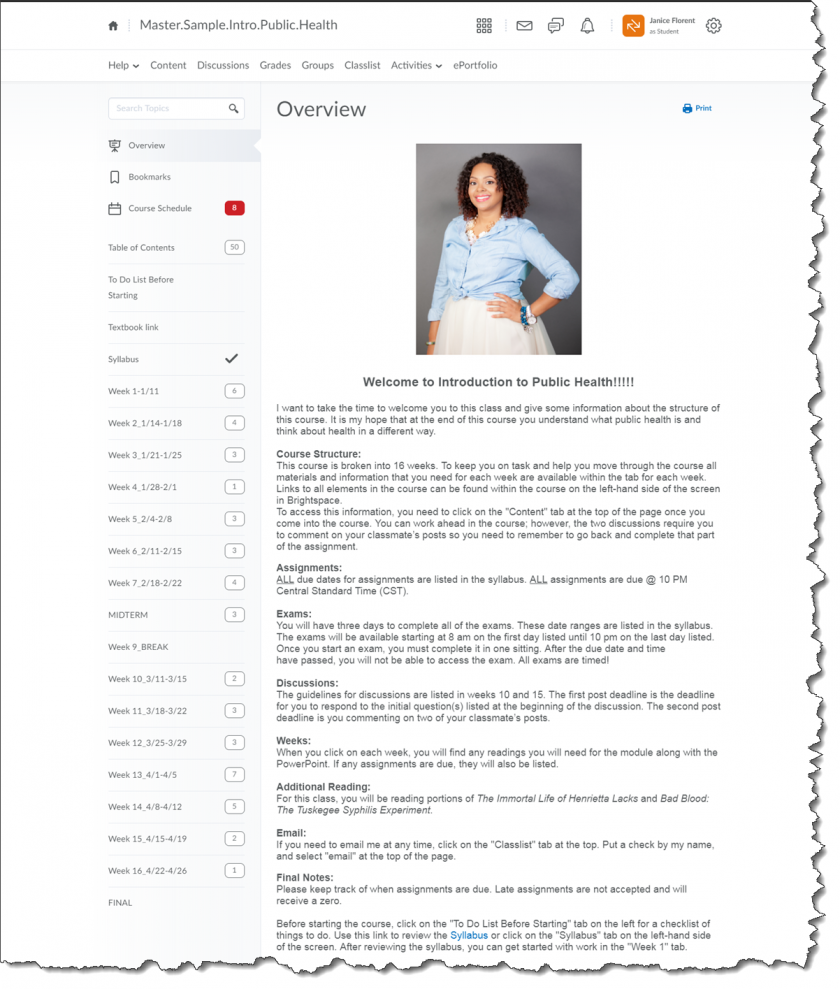
Usability: The Table of Contents in this Introduction to Public Health online course is organized by weeks making it easy for students to navigate through the course to find the coursework that they have to complete each week.
Accessibility: The Course Overview in this sample Introduction to Public Health online course uses headings to organize the information. If a student had to access the page with a screen reader they can easily navigate through the content in the course overview using the headings.
Example 4 - Computer Based Information Systems
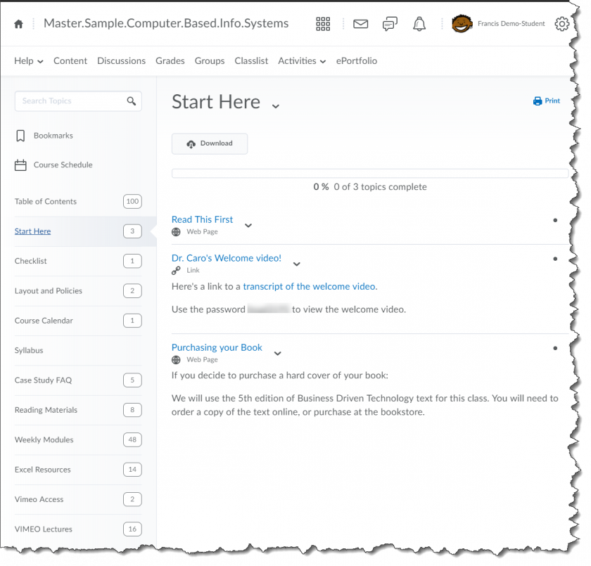
Usability: The Table of Contents in this sample Computer Based Information Systems online course has the course materials organized by week and includes some modules that are organized by type. This makes it easy for students to navigate the course to find either the module for the week or to locate one of the resources.
Accessibility: In this sample Computer Based Information Systems online course, the instructor has provided a welcome message video. A transcript of the video is also provided.
Example 5 - Introduction to Physical Geography
Accessibility: In this sample Introduction to Physical Geography course, students can find detailed information on where to get technical help in the Technology Requirements and Where to Get Help topic. References to the resources are hyperlinked with descriptive links so that students can go directly to the resource. The descriptive links help both students with and without a visual impairment.
Usability: Students can find all the information related to the technology requirements and where to find help in this topic. Individual technology resources are hyperlinked, in other areas of the course where appropriate, so students do not have to return to this topic to get help.
Example 6 - Introduction to Psychology
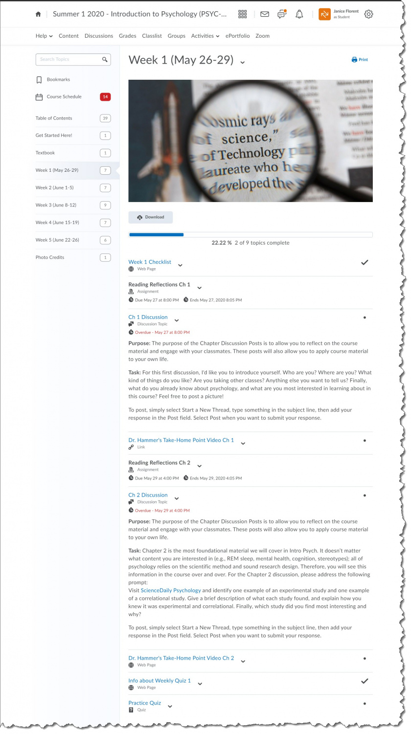
Usability: In this sample Introduction to Psychology online course, students can find all the information necessary to complete their tasks for the week in the module. Each weekly module follows the same format. Each module begins with a checklist, followed by the chapter readings, chapter discussion, and the take-home point for the chapter. The tasks for the week ends with an assessment.
Accessibility: Information on the page is chunked so that students can easily find information and if a student had to access the page with a screen reader they can easily navigate to the information on the page. Hyperlinks have descriptive links which help both students with and without a visual impairment.
Example 7 - Introduction to Psychology
Usability: In this sample Introduction to Psychology online course, students can find information about what to expect for their first quiz in this "Info About Weekly Quiz 1" page. Students are required to take a practice quiz before they can take the actual quiz. The purpose of a practice quiz and the requirement to take the practice quiz first is explained to the students. A Release Condition is used to insure that Quiz 1 is released only after the student has taken the practice quiz.
Accessibility: Information on the page is organized so that students can easily find the information. Hyperlinks have descriptive links which help both students with and without a visual impairment.
